 Mon-Fri: 8am to 5pm ~ Sat – Sun: Closed


Informational
What’s Trending: 2026’s Top Paint Colors
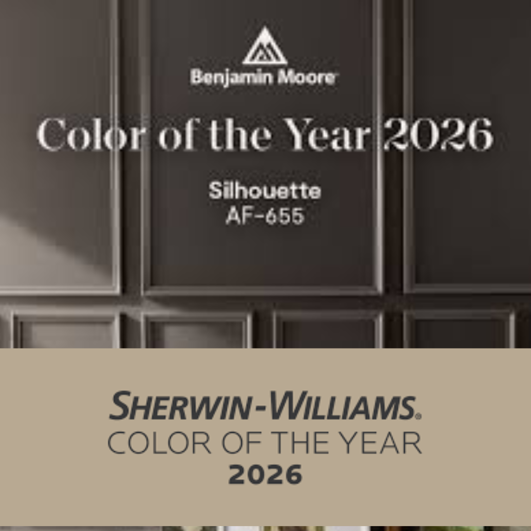
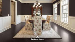
🎨 Benjamin Moore — “Silhouette” AF-655

For 2026, Benjamin Moore has chosen Silhouette AF-655 as its Color of the Year. This isn’t a loud or flashy hue — it’s a rich, sophisticated neutral: a mix of deep espresso and subtle charcoal. Benjamin Moore+2Architectural Digest+2
Silhouette is meant to evoke the elegance of a tailored suit: refined, timeless, and versatile. The brand describes it as a color that can elevate a room from “expected to exceptional.” Architectural Digest+1
To support the main color, Benjamin Moore also released a full 2026 palette — including softer neutrals and complementary tones — giving homeowners flexible options if they want to paint multiple rooms or accents. Benjamin Moore+1
Why it’s appealing:
-
It’s moody but still warm — great for cozy or sophisticated interiors.
-
Works beautifully in living rooms, bedrooms, or home offices where you want a grounded, elegant ambiance.
-
Pairs nicely with lighter neutrals, creamy whites, or even natural wood — ideal for layering color and texture.
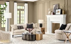
🏡 Sherwin-Williams — “Universal Khaki” SW 6150
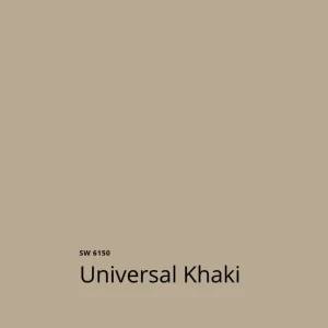
While Benjamin Moore opted for a deep, elegant neutral, Sherwin-Williams went for something softer and more organic. Their 2026 Color of the Year is Universal Khaki SW 6150 — a mid-tone neutral with warm, earthy undertones. Sherwin-Williams+2HGTV+2
Described as “grounded,” “tailored,” and “timeless,” Universal Khaki is meant to feel like comfort and stability — a subtle backdrop that complements wood tones, creamy whites, and natural materials. HGTV+1
Why it’s appealing:
-
A warm neutral that’s easy on the eyes and fits many design styles — from modern minimalist to cozy farmhouse.
-
Great for open-concept spaces or rooms with a lot of natural light, where you want softness without starkness.
-
Works beautifully with natural textiles, wood, stone — perfect if you want a subtle, nature-inspired vibe.
What Their Choices Say About 2026 Design Trends
2026 seems to be a year where paint makers are leaning away from loud, trendy colors and instead embracing a return to timelessness, comfort, and versatile sophistication.
-
With Benjamin Moore’s Silhouette, there’s a shift toward elegant, classic — a reflection of renewed interest in materials and styling that stand the test of time rather than quick trends. Architectural Digest+1
-
Sherwin-Williams’ Universal Khaki underscores a trend toward nature-inspired warmth and simplicity, perhaps as more homeowners lean into calm, grounded interiors over stark minimalism or bright statements. Sherwin-Williams+1
In other words: 2026 is about spaces that feel lived-in, restful, and grounded — places you want to come home to.
How to Use These Colors in Your Home
-
Anchor walls or cozy rooms → Use Benjamin Moore Silhouette for dining rooms, home offices, master bedrooms, or any space where you want a rich, enveloping atmosphere.
-
Whole-home neutral base → Use Sherwin-Williams Universal Khaki in living rooms, kitchens, or open floor plans for a warm, cohesive backdrop.
-
Mixed and matched → Try combining the two: use Universal Khaki for most of your home, then accent a feature wall or reading nook with Silhouette for depth.
-
Material pairing → Both colors pair beautifully with natural wood floors, stone surfaces, woven textiles, and soft lighting — ideal if you want a warm, timeless aesthetic.
Final Thoughts
2026’s top picks from Benjamin Moore and Sherwin-Williams show a clear design mindset: elegance without excess, warmth without being boring, and versatility without compromising character.
Whether you prefer the refined sophistication of Silhouette or the soothing neutrality of Universal Khaki — or even a mix of both — these colors give you flexibility and longevity.
If you like, I can also create a visual mood-board for 2026 combining both color palettes + sample room setups (living room, kitchen, bedroom) to help you imagine how they might look in a real house.
Recent Comments